Crash Course: Color Theory
So, colors.
Use of colors can mean the difference between a solid, beautiful design scheme and a horridly offensive project. Choosing colors can be one of the most important and also challenging aspects of design. In this post, I’ll give you the quick and dirty on how to pick the right colors for your design adventure (whether it be for a website, logo or even your mom’s living room walls).
In order to get started, a basic understanding of the color wheel is essential. Below is a picture of the most commonly used 12-color version:

Different colors are made from the three primary colors which are red, blue and yellow. By mixing combinations of these three (pictured below), you can make virtually every color visible to the human eye. White and black can be added to lighten or darken the hue.

Secondary colors are made when primary colors are mixed together. (Red and blue make violet, yellow and blue make green, yellow and red make orange).

Tertiary colors (pic below) are a bit trickier, but extremely dynamic and eye-catching. These are the colors created by mixing a primary color with a secondary color on either side of it. These are the colors like blue-green and yellow-orange.

There are a few terms for combinations on the color wheel that you should understand in addition to primary, secondary and tertiary colors. These combinations are often referred to as “color harmonies” and “color schemes”.
Complementary: Complementary colors are colors that are opposite from one another on the color wheel. Using these together can give a piece a feeling of energy and excitement because of the vivid contrasts. Because of this, they can sometimes be over-stimulating.
How to use: Avoid using this color scheme on heavily textual pieces or on a very large scale. I’ve found these combinations are most successful in small projects where you want certain details to ‘pop’.

Analogous: Analogous colors sit next to each other on the color wheel.
These typically work well together and are pleasing to look at. These colors are actually often found in nature.
How to use: To use successfully in graphic design, I’d suggest using two main colors and then a third color for accents.
Below are just a few examples of the combos you can get when you use this color scheme.
Triadic: Triadic colors are found on the color wheel in equilateral triangles (they are evenly spaced around the wheel).
How to use: Since these are composed of 3 colors that work dramatically together, it is a good idea to use this scheme similarly to the analogous: use one main color and let the other two support it.

Monochromatic: Monochromatic color schemes are a collection of different tints and shades of a single color.
These are typically pleasing to the eye and work effectively together for a serious and straightforward piece. However, they are lacking the ‘oomph’ of a vibrantly colored piece and can sometimes be somewhat boring and uninventive.
How to use: My advice when using a monochromatic scheme is to create diversity by adding enough visual interest in the design elements of your work. In doing this, you create a nice balance between a soothing color scheme and a dynamically visual piece.

Of course there are more combinations that work stunningly well together, but these first few combo options are a good way to get started. Experimenting is key.
When picking colors, it’s essential to consider the final outcome of the mood you want to convey to the viewer.
Brighter, dramatic color combinations can be exciting and fun.
Neutral, monochromatic schemes can be more serious and professional. Keep it interesting with these schemes by adding a contrasting color that you use sparingly throughout the design to pull out key points of information.
A helpful tip is to keep the amount of colors that you use manageable. Too many diverse colors can be confusing and unpleasant to look at. On the other hand, too few colors without diversity can be boring and equally unpleasant if you don’t have very many images to accompany the design. Try to find a good balance.
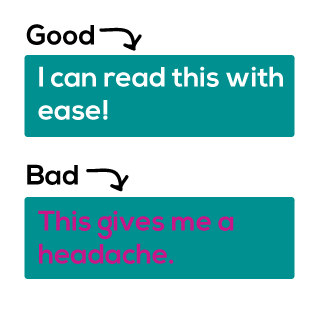
Also, make sure that any text you’re using is readable. This means keep the contrast between the color of the background and the color of the text to a happy middle ground between too stark (white text on black background) and too similar (gray text on different shade of gray background).
I’ve found that it’s helpful for me to keep a folder or Pinterest board handy for when I come across a design with a good color scheme. I also like to use photographs and color schemes from nature for inspiration if I’m feeling stuck. It’s a great idea to start building these folders for future projects.
Another excellent resource for inspiration is the Adobe kuler project here.
This is one of my favorite color websites because it showcases user-generated color schemes with star ratings. So many people can’t be wrong, right?
If you’re uncertain about a color combo you’ve chosen, it is always a good idea to communicate with your clients or friends and family to get a few other opinions. Be open to critique and advice.
Yay colors!

Pingback: Pattern + Color + Texture = A Beautiful Home | creatiik